August 5, 2024

30 Day Drawing Challenge - Day 5


Boats 2


This artwork was done as part of a drawing challenge in Ian Roberts' "Mastering Composition" courseFor general information and explanation, please refer to the Foreword section of my Day 1 post here.


I drew this from a photo taken by Ian Roberts.  This version of the boats was done on white paper, and it felt, as if it took forever to fill in the water and background trees.  (Graphite pencil on Strathmore Bristol Smooth, 300 series).
      Just for comparison, below you'll also find a vertical version of the same scene (done on Day 4 of the challenge). You can see how a difference of orientation, cropping and paper can affect the overall feeling/mood of an image. To me, the horizontal one feels more calm and somewhat introspective.


*** Because I might use some of the images for future work, I kindly ask that you do not copy or use my drawings as ideas or reference for your own work, or re-post them elsewhere.

 Link to my Instagram page here.

August 4, 2024

30 Day Drawing Challenge - Day 4


Boats 1


This artwork was done as part of a drawing challenge in Ian Roberts' "Mastering Composition" courseFor general information and explanation, please refer to the Foreword section of my Day 1 post here.


I drew this from a photo taken by Ian Roberts.  Because the mid-values are already present on toned paper, this drawing was easier and faster to do, than on regular white surface. I also found the surface of the paper to be rather textured. Consequently, a small drawing like this one (approx. 4x6") ends up looking very grainy as well. (Graphite and white charcoal pencils on Strathmore Toned Tan, 400 series).


*** Because I might use some of the images for future work, I kindly ask that you do not copy or use my drawings as ideas or reference for your own work, or re-post them elsewhere. 


Link to my Instagram page here.


August 3, 2024

30 Day Drawing Challenge - Day 3


Bust Sculpture 2


This artwork was done as part of a drawing challenge in Ian Roberts' "Mastering Composition" courseFor more information and explanation, please refer to the Foreword section of my Day 1 post here.


I drew this from a photo of a bust, taken by Ian Roberts.  Same bust as on Day 2, but different arrangement. Slightly easier and much faster to draw, since all the middle values are already present in toned paper. (Graphite and white charcoal pencils on Strathmore Toned Gray, 400 series).


*** Because I might use some of the images for future work, I kindly ask that you do not copy or use my drawings as ideas or reference for your own work, or re-post them elsewhere. 


Link to my Instagram page here.


August 2, 2024

30 Day Drawing Challenge - Day 2


Bust Sculpture 1


This artwork was done as part of a drawing challenge in Ian Roberts' "Mastering Composition" courseFor more information and explanation, please refer to the Foreword section of my Day 1 post here.


I drew this from a photo of a bust, taken by Ian Roberts.  Quite challenging, as human features tend to be, yet a lot of fun, as I enjoy this type of classic imagery. Pencil on Strathmore Bristol Smooth, 300 series.


*** Because I might use some of the images for future work, I kindly ask that you do not copy or use my drawings as ideas or reference for your own work, or re-post them elsewhere. 


Link to my Instagram page here.


August 1, 2024

30 Day Drawing Challenge - Intro and Day 1


Foreword

Earlier this year, I took Ian Roberts' "Mastering Composition" course.  I found it incredibly informative, interesting and enjoyable. While the focus was obviously on composition, the course also helped improve my artistic practice in general, largely due to a 30 day drawing challenge, held after the course ended. In the past, I heard numerous artists talk about the importance and benefits of daily (or at least regular), drawing practice. Hearing artist Andrew Tischler talk about his own Sketchendeavour (on his You Tube channel), got me intrigued enough to actually consider doing an art challenge. So, when an opportunity presented itself, I felt ready to dive in.
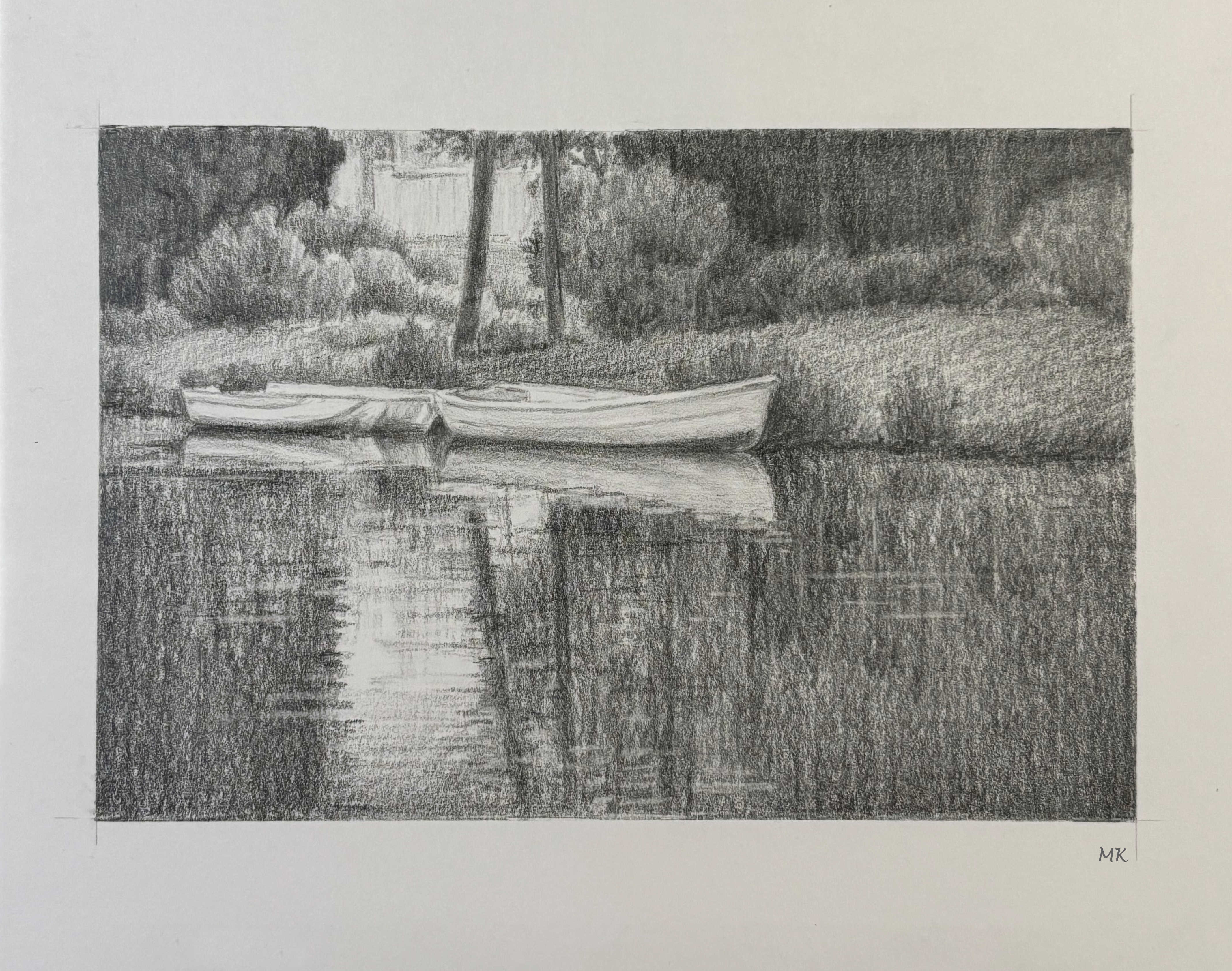
    Because this was not specifically a drawing course, the aim did not lie in producing "finished", high-end, best quality work, but rather something akin to good working drawings. The type one would do when still trying to work out general concepts, positioning, values, i.e. composition, prior to starting finished work, but past the stage of sketches and thumbnails. Such drawings give a good general idea and flavour of an image, without large investment of time, energy and money. Still, because they need to reflect the essence of the planned work, they do require some level of drawing skill and efficiency, and that is where regular practice can be very beneficial. I need to add that in real life, these drawings look more smooth and presentable. I photographed them with iPhone15, and the photos emphasize every single bit of texture and graininess (I'm not the only one who encountered this issue).
       All drawings for this challenge were done from reference photos, which were taken either by the course instructor, or myself. I will not include these photos in my posts, since the aim was not to copy them, but use them as reference, meaning lots of tweaks, additions, deletions, etc. However, I will still indicate whether an individual drawing was done using my or the course photo.We were allowed to draw the same subject as many times, as we liked, and I did end up with a few similar images. One reason is that I simply enjoyed some subjects enough to draw them again. Also, it was not easy to come up with 30 completely new images, edit and crop them, then do a roughly 4x6" drawing, and keep on schedule.  While we were allowed to do more than one drawing per day, I simply did not find the time to do that. In fact, to the very end I wasn't sure if I'd be able to complete 30 drawings in 30 days. This is one of the reasons why I post all of this after the fact, as doing so in real time would have been too time consuming, and the probability that I'd just quit mid-way would have been very high.

DAY 1 - Barn

At the very beginning of the course, we were tasked with drawing a barn from a given photo. As part of the 30 Day Challenge I decided to draw the same barn again, to see not only how my drawing has changed, but also how I would crop it the second time around. I must say, that even though the later drawing was done much more loosely and quickly, the overall flavour and character of the image has not changed that much. Lesson learned - that I can skip many details and nuances (and save so much time), and still get a reasonably realistic and clear image.

First barn drawing (on Denik, Heavyweight, Mixed Media Sketchbook paper):


Second barn drawing (on Strathmore Bristol smooth, 300 series):


*** Because I might use some of the images for future work, I kindly ask that you do not copy or use my drawings as ideas or reference for your own work, or re-post them elsewhere. 

Link to my Instagram page here.


December 7, 2022

Winter Scene


Hello! Since it's December and winter is here, I'd like to show you a little painting that reflects the current season. Because I am still very much learning to work with watercolor, I decided to follow a tutorial of a much more experienced artist - Karen Rice. The one I chose is called "An Essential Lesson in Watercolour", and can be accessed on You Tube here. I must say that Karen's instructions were very clear and easy to follow, and I had lots of fun painting along with her. Using watercolors is a little bit like herding water, so everyone's version will look different. Add to that one's choice of paint (Qor), paper ( Canson Montval), a tendency to tweak, and the results can vary dramatically from the original. 😄 Unlike Karen, I decided to skip adding human figures to my painting. Since I had to work rather quickly (before everything dried to a crisp), I did not take any 'in progress' photos. I know that my results are far from perfect, but I still have a certain fondness for the finished picture.
     Wishing everyone a wonderful and creative day, and a peaceful Holiday Season.


October 13, 2022

Red Apple in Oil Pastels


Recently, I got myself some oil pastels, mainly to try to find a medium that would be easy and quick to use for backgrounds in coloured pencil paintings. I also wanted something that will work nicely in paintings done exclusively in oil pastels. I remember using them years ago, in high school, and rather liking them. So, after some initial research, I settled on a small 12-pack of Sennelier oil pastels and Caran d'Ache Neopastels. To try them out, I decided to draw a red apple, using GreArt's How to draw apple with oil pastel tutorial on YouTube. This way, the topic and all the planning is already done for you. While the main components of my picture are very similar to those in the tutorial, I decided to completely change the leaf (to more closely resemble an actual apple tree leaf), and skipped the water droplets. I have nothing against water droplets or drawing them (they can look great and add a wonderful visual interest), but I see so many water droplets being drawn on nearly every apple and fruit these days, that I just simply don't want to look at them for now (much less draw them).


     Anyway... I found both brands of oil pastels wonderful to work with, at least on Strathmore Bristol Vellum, 300 series, paper. The Sennelier are famous for their creaminess and that they were, being best used as a last layer and for glazing. The Neopastels are a bit harder/waxier, but oh, so velvety in finish! Unfortunately, I was unable to fully capture the gorgeous, deep, rich finish of the pastels in photographs. No matter what light, positioning and camera I used, the lens could not capture the many details and nuances of the painting.
     Also, FYI, I used Canvy app to present my painting as if it was mounted on a wall, which appears to be much larger in scale than it actually is. In reality, the measurements of the image are only 12x16.5 cm/ 4.75x 6.5".
 
     Below are some of the steps of my drawing process.
 
     First, I roughly laid down the main color areas of the apple. I blended the colours in a vertical direction, but not very smoothly, in order to reflect the splotchy nature of apple skin. From then on, I added the stem and continued to add details, like more splotches, shading/highlights.

 
When I was more or less satisfied with the general look of the fruit, I added the leaf. I looked at a variety of apple leaf photo references, in order to see their general character. The leaf in GreArt's tutorial looked a bit too much like a hoya plant leaf for my liking.
 

After the apple was done, it was time to add the background. I decided to layer blue on top of black for added richness and depth. The process was so fast! If I used coloured pencils, it would have taken me many long hours just to build up that kind of smooth, dark, rich background. Here, it took me less than one hour for the dark navy background! I love how easily the Neopastels blended and layered! 

 
And this is what it looked like with all of the main components in place and blended. From this point on, it was just a matter of dealing with details and making adjustments. I  cleaned up the edges of the stem and leaves with  black and/or very dark  navy Prismacolor pencils. I also used a couple of coloured pencils to add some detail to leaf veins and small speckles on the apple.


And here it is finished, along with some photos of the details.