April 16, 2026

Just... Apple - A Small Painting and the Quiet Power of Familiar Things

Two hands holding a small 6x6 inch square canvas showing an acrylic still life painting of a green apple with leaves and a twig, by Margaret Kiprenko.

Sometimes, the most satisfying thing to paint—and to look at—is something completely familiar.

This 6x6" acrylic painting was done for Canada National ‘Bears’ Mural Mosaic, with green as the assigned color scheme. I took a plain green apple, a twig, and some draped fabric, and gave them my full attention.

Acrylic still life painting of a green apple with leaves and a woody twig on draped teal fabric, 6x6 inches, by Margaret Kiprenko.

Fruit has been, and continues to be, a frequent subject for many artists. An apple, for example, has a form that feels just right—it’s balanced, textured, full of color. In its apparent simplicity, it doesn't demand anything from us, yet it offers a specific kind of quiet abundance that is naturally attractive.


Early stage of an acrylic still life painting showing a white and beige underpainting of an apple with leaves against a dark teal background, by Margaret Kiprenko.

Artist's palette showing mixed acrylic paints in greens, teals, and greys used for a green apple still life painting, by Margaret Kiprenko.
 
There isn't a hidden message or a complex metaphor here; it is simply about the pleasure of seeing an ordinary object held in a soft, deliberate light. I wanted this painting to offer a visual 'pause'—the kind of quiet moment we find when we notice something that strikes a chord and allows everything else to recede for a moment.

It is Just... apple. It’s an invitation to slow down and enjoy a moment of simple, visual harmony. It’s a reminder that beauty doesn't always have to be grand to be worth noticing.


Close-up detail of an acrylic still life painting showing a woody twig and green leaves beside a green apple, by Margaret Kiprenko.


March 11, 2026

Enduring Spirit

My latest painting—acrylics on a 6x6” canvas board—is a reflection on resilience and the Canadian spirit. While a single acorn might seem small, it carries a narrative of perseverance that I find especially relevant these days.

The square acorn painting by Margaret Kiprenko displayed on a small wooden tripod easel against a neutral, textured grey background. The studio lighting highlights the canvas texture and the warmth of the wood tones.
 
The acorn is a vessel of time—holding the history of the oak and the future of the forest. It reflects a link to our country’s past and a connection to the landscape we inhabit. It suggests that our strength is rooted in endurance and a collective wisdom built over generations. Beyond a symbol of stability, it is a reminder of our capacity for growth and the inner power that allows us to persevere and transform.
 
A square-format acrylic still-life painting of a single, large acorn resting on a wooden surface. A crisp maple leaf is carved into the acorn's shell. Warm, atmospheric light illuminates the scene against a background of soft, diffused autumn leaves. Painting by Margaret Kiprenko. 
 
Because I got so engrossed in the work, I simply forgot to take any progress photos along the way. To show the physical reality of the piece and its scale, I am sharing a photo of the finished painting held in my hands.

A person's hands holding the small square acorn painting by Margaret Kiprenko to show its scale.
 
Enduring Spirit is a tribute to the stability and longevity of this country. It is an expression of pride in our ability to remain steadfast and to continue growing, regardless of the challenges we face. 

Close-up of an acrylic painting showing the tactile, layered brushstrokes within a carved maple leaf symbol on an acorn. Painting by Margaret Kiprenko


February 4, 2026

Serenity in Between


Original acrylic painting Serenity in Between by Canadian artist Margaret Kiprenko - small 6x6 inch teacup still life in blue

I recently finished this small (6x6”) acrylic painting in light blue theme, as my contribution to the Canada National ‘Bears’ Mural Mosaic project.

In a time when we often feel overwhelmed by noise and stress, I wanted to create an image that reflected beauty, calm, and comfort. I envisioned a scene that, to me, felt like a serene, comforting bubble - the quiet ritual of a cup of tea and the promise of a pause in a busy world.
 

"Serenity in Between" speaks to those moments we carve out for ourselves - a breathing space in our day when we sip a warm drink, reflect, and just be. It is about finding stillness amidst everything else - that quiet  interval where the world’s demands can fade into the background for a little while.

Serenity in Between - original acrylic still life painting of teacup with white flower and gold spoon by Margaret Kiprenko

I believe that art has the power to offer some comfort and respite, and I hope this painting brings a little bit of that peaceful feeling into your day, just as it did for me while creating it.

Detail of original acrylic teacup painting showing brushwork and soft blue tones - Margaret Kiprenko Canadian artist

November 10, 2025

Quiet Sentinel


🫎 Hello! I have a painting to share today, which came to life as part of Global Roots, America - Nature's Gift mural mosaic project. This initiative saw artists contributing small, 6x6” tile paintings, which, when assembled, form a single, large piece. From the three tiles I contributed to this project, this one is titled "Quiet Sentinel."

The main creative constraint for my tile was an assigned palette of warm colors. The challenge was finding a subject in nature, that naturally lent itself to those golds, oranges, browns, and reds.

I immediately looked to an autumn setting. The sun-lit foliage provides the perfect foundation for a warm scheme. To stand against this backdrop, I chose a moose. Consequently, the animal, the field, and the woods - exist harmoniously within the necessary warm spectrum.


As a proud Canadian, painting such an iconic animal, subtly accompanied by our national flag, felt like a natural choice.

Here is a small peek into the painting process:


Even though it was part of a larger project, I approached "Quiet Sentinel" with the intention that it could also stand completely on its own. I wanted it to be a complete scene - a reflection of Canadian spirit, and of a moment of peace, and watchfulness in the wilderness. The title, "Quiet Sentinel," aims to reflect that sense of a grounded, observant presence amidst the gentle beauty of an autumnal landscape.

Thank you so much for visiting. Wishing everyone a wonderful and peaceful day.


October 2, 2025

Mellow Light of Autumn

Hello! Today, I want to share another tile that I painted for the Global Roots America Nature's Gift mural mosaic project. 

This time, the required color scheme was orange. As you can see, I chose to paint a pumpkin, since I find all sorts of gourds and pumpkins visually intriguing.  I called it the Mellow Light of Autumn. There is a particular kind of light that only autumn can bring. It’s not the highly energetic, bright brilliance of summer, nor the stark, crisp clarity of winter. It is softer, richer, and comforting - a mellow light that seems to wrap the world in a warm, golden embrace. In this small painting (6x6"), I aimed to capture a bit of that essence. A rich and warm coloured pumpkin bathed in gentle, late-afternoon sun reminds us of cozy autumn moments: sipping a warm drink by the window, watching the leaves drift, or simply enjoying the tranquil beauty outside.  As such, it evokes a sense of inner peace and contentment, and a hope that despite all of the world's challenges, all will be well. It is also a reminder that we can draw comfort from the simple and little things in life, whether it's just a pumpkin, a bit of sunlight or... a small, little painting on our shelf. 

A little peek into my painting process (with the final image at the end)...

After putting down a sketch, I established the darkest areas with some gray underpainting, and then filled in the background. I used orange and rusty hues throughout, to stay compliant with the assigned color scheme. 


Working more or less from back to front, I then painted the back leaves and filled out the the pumpkin.


All that was left were the front leaves, stems and tendrils, and of course, final tweaks and adjustments.


And here is the finished painting. 


I hope this piece brings a little bit of that mellow autumn light and serene beauty into your day. 

September 4, 2025

Blue Parrot


I decided to participate in Global Roots' Mural Mosaic project again. I like being a part of a larger, community endeavour, and this time I signed up to paint three tiles for the America Nature's Gift mural. Today, I am showing my Blue Tile, based on a photo by Nora Hanasy Cheers. Done in acrylics, on a 6X6" canvas board. I chose this image because, well... obviously partly due to its colour, since it fits the required colour scheme. However, there are many blue things one can paint. I liked this parrot, because it has a certain playfulness in its expression. As if he is up to some good natured shenanigans. 

Below, I show a little bit of my process, for those of you, who find this sort of thing helpful.


And here is the final result


Playful experimentation

Sometimes, I just like to sit down with my art supplies, and simply experiment. Usually, any paitings and drawings created in these endeavours are very loose (at least for me), and not necessarily accurate with respect to colours, shapes, proportions, shadows, etc. Just simple play and discovery.


Not long ago, I decided to test out Derwent Chromaflow pencils on Legion Lenox cotton paper. Decided to draw a simple, small cherry, since the paper I have is very tiny - you know, one of those mini pads we've all seen (about 2.5" x 3.75" in size). Liked the pencils - they reminded me very much of Prismacolor Premier in feel, but maybe a tiny bit less buttery, and more easy to smear. Liked the paper very much. I am in the market for a nice cotton paper good for colour pencil work. Unfortunately, considering the current political and economic climate, it may not be the most optimal option for me, as it is produced in United States, and I live in Canada.

Also decided to try Louise Fletcher's free Creative Reset workshop. Lots of experimentation encouraged there. So, I decided to paint something using only palette knife and a couple of silicone paint shapers, since I've never tried doing that before. I figured I'd paint an onion, since the shape is simple and easy. Well, wasn't as easy, as I thought it would be. An uphill battle of sorts, to be honest. It was a bit labour intensive to build up and spread the paint. I used Liquitex Basics, so that definitely played a role, too. Also, the hue shades sometimes don't produce results you'd expect when mixing. The onion came out looking unbelievably rustic, but I'm not mad at it. Has its charm. Reminds me of an oil pastel painting.


I also wanted to try coloured pencils on a wash of watercolour. Here, I was going for a bit of a rustic feel as well. I picked Schmincke's Horadam Aquarell super granulating colours, laid them on thick and very wet, hoping for some nice cauliflowers, but... nooooo. The paper (Canson Montval) just kept slurping up the water so quickly. No matter how much I pre-wetted it and how much, or little, water I added, and how much I directly misted it with water. Just didn't come out rustic enough. I did a light wash of colours over the onion, too. After it dried, I loosely layered Prismacolor Scholar pencils for added depth, color and detail.  It was fun to experiment with and I reminded myself that I'm really not too crazy about the Scholar pencils. But, they're ok for basic applications.


June 26, 2025

Polar Bear at the gallery


Well, my bear painting ended up on a wall in our local art gallery. The Station Gallery in Whitby, ON, made a call to Canadian artists, to submit works, which somehow incorporate Canadian Flag. Since my polar bear painting fit the requirements, I submitted it for consideration. They accepted, and here he is. 😀
The exhibit, titled "Oh, Canada Project", runs until October 19, 2025. If you live in Durham region, Ontario, or will be visiting, be sure to check out this exhibit and more works of art that are on display. 

May 14, 2025

Canadian Polar Bear in Blue


Some time ago, an ad for a Mural Mosaic project popped up on my Facebook feed. It refers to a collective project, in which participants paint an image on a small, 6x6" tile, in assigned color scheme. Once finished, they each submit their image to Global Roots Team (project organizer), which then assembles all images into one large mural. That mural (just one among many different ones) gets installed in one of the cities/towns around the world. To get a better idea of what I am talking about, please visit the Global Roots Mural Mosaic website here.
    This type of project felt right up my alley, because I do enjoy being a part of something larger and collective in nature. So, I signed up for an available Canadian project - "Nature's Bounty". A short while later, I received a package with instructions, a 6x6" canvas board, some acrylic paint, and a little easel. My assignment was to create a light blue tile, which means that the overall image must come across as light blue, but can include other colors, if they make up less than 20% of the overall picture area. I wanted to create an image that reflected Canadian nature and went well with the color scheme. I figured that a polar bear would fit the need. However, because polar bears also live in other parts of the world, I decided to add an image of a Canadian flag. Due to world events, which took place well after I signed up for this project, the flag has taken on additional significance. Since Canadian flag is rather intense in color and contrast (red and white),  I decided to drastically tone down the red, so that it would fit the color scheme better.
    Overall, this was a very enjoyable project for me. It is also a great idea for group/family projects, where kids and adults alike can spend some creative time together.
    All the tile images have been submitted by now, and the Global Roots Team is working on assembling them together. The unveiling of the mural should take place sometime in the Fall of 2025 - the location hasn't been announced yet.
    Below I included a couple of photos from the painting process.


The finished bear:


August 31, 2024

30 Day Drawing Challenge - Summary and Conclusions


Drawing Challenge -
Summary and Conclusions


The drawings below were done as part of a drawing challenge in Ian Roberts' "Mastering Composition" courseFor general information and explanation, please refer to the Foreword section of my Day 1 post here.


So, here we are, 30 drawings later... I must say that the challenge was definitely worth my time and effort. I definitely noticed that the process of drawing became easier and faster as time went on. Most of all, I found that it was much easier for me to visually express what I wanted. It is kind of like learning to write. After a lengthy process of practice, one no longer thinks about or pays attention to forming individual letters and words. Instead, one just uses them automatically, in order to communicate thoughts and messages.
    It was a great and rewarding challenge, and I highly recommend something of this kind to all, who want to up their creative game. Of course, there are is a great variety of art challenges out there, from individual, short ones, to ones done with a group of people and for longer periods of time. This article from Artful Pursuits not only lists some of the benefits of art challenges, but also gives a few examples of different types.
    If you followed my posts throughout these past 30 days - thank you so much for joining me on this journey. Your support and presence means a lot to me, and I really appreciate you stopping by. In the nearest future, I plan to take one more Ian Roberts' art course, to push myself artistically even further. See you in future posts. Wishing you a beautiful day.


*** Because I might use some of the images for future work, I kindly ask that you do not copy or use my drawings as ideas or reference for your own work, or re-post them elsewhere.


Link to my Instagram page here.


August 30, 2024

30 Day Drawing Challenge - Day 30


Cedar Path 2


This artwork was done as part of a drawing challenge in Ian Roberts' "Mastering Composition" courseFor general information and explanation, please refer to the Foreword section of my Day 1 post here.


I drew this from my own photo, which I took in Tooley's Mill Park, Courtice, Ontario. (Graphite pencil on Strathmore Bristol Smooth, 300 series).


*** Because I might use some of the images for future work, I kindly ask that you do not copy or use my drawings as ideas or reference for your own work, or re-post them elsewhere. 


Link to my Instagram page here.


August 29, 2024

30 Day Drawing Challenge - Day 29


A Bridge In The Woods


This artwork was done as part of a drawing challenge in Ian Roberts' "Mastering Composition" courseFor general information and explanation, please refer to the Foreword section of my Day 1 post here.


I drew this from my own photo, which I took in Tooley's Mill Park, Courtice, Ontario. (Graphite pencil on Strathmore Bristol Smooth, 300 series).


*** Because I might use some of the images for future work, I kindly ask that you do not copy or use my drawings as ideas or reference for your own work, or re-post them elsewhere. 


Link to my Instagram page here.


August 28, 2024

30 Day Drawing Challenge - Day 28


Forest Path


This artwork was done as part of a drawing challenge in Ian Roberts' "Mastering Composition" courseFor general information and explanation, please refer to the Foreword section of my Day 1 post here.


I drew this from my own photo, which I took in a wooded area in Southern Ontario. (Graphite pencil on Strathmore Bristol Smooth, 300 series).


*** Because I might use some of the images for future work, I kindly ask that you do not copy or use my drawings as ideas or reference for your own work, or re-post them elsewhere. 


Link to my Instagram page here.


August 27, 2024

30 Day Drawing Challenge - Day 27


Trees


This artwork was done as part of a drawing challenge in Ian Roberts' "Mastering Composition" courseFor general information and explanation, please refer to the Foreword section of my Day 1 post here.


I drew this from my own photo, which I took in a local park. (Graphite pencil on Strathmore Bristol Smooth, 300 series).


*** Because I might use some of the images for future work, I kindly ask that you do not copy or use my drawings as ideas or reference for your own work, or re-post them elsewhere. 

Link to my Instagram page here.


August 26, 2024

30 Day Drawing Challenge - Day 26


Country Road


This artwork was done as part of a drawing challenge in Ian Roberts' "Mastering Composition" courseFor general information and explanation, please refer to the Foreword section of my Day 1 post here.


I drew this from my own photo, which I took in Prince Edward Island, Canada. In the background is Confederation Bridge, an 8 mile long structure, which connects PEI with New Brunswick . (Graphite pencil on Strathmore Bristol Smooth, 300 series).


*** Because I might use some of the images for future work, I kindly ask that you do not copy or use my drawings as ideas or reference for your own work, or re-post them elsewhere. 


Link to my Instagram page here.


August 25, 2024

30 Day Drawing Challenge - Day 25


Sunny Day in Early Spring


This artwork was done as part of a drawing challenge in Ian Roberts' "Mastering Composition" courseFor general information and explanation, please refer to the Foreword section of my Day 1 post here.


I drew this from my own photo, which I took in a local park, in March. (Graphite pencil on Strathmore Bristol Smooth, 300 series).


*** Because I might use some of the images for future work, I kindly ask that you do not copy or use my drawings as ideas or reference for your own work, or re-post them elsewhere. 


Link to my Instagram page here.


August 24, 2024

30 Day Drawing Challenge - Day 24


Cedar Path 1


This artwork was done as part of a drawing challenge in Ian Roberts' "Mastering Composition" courseFor general information and explanation, please refer to the Foreword section of my Day 1 post here.


I drew this from my own photo, which I took at the Tooley's Mill Park in Courtice, Ontario, Canada. (Graphite pencil on Strathmore Bristol Smooth, 300 series).


*** Because I might use some of the images for future work, I kindly ask that you do not copy or use my drawings as ideas or reference for your own work, or re-post them elsewhere. 

Link to my Instagram page here.


August 23, 2024

30 Day Drawing Challenge - Day 23


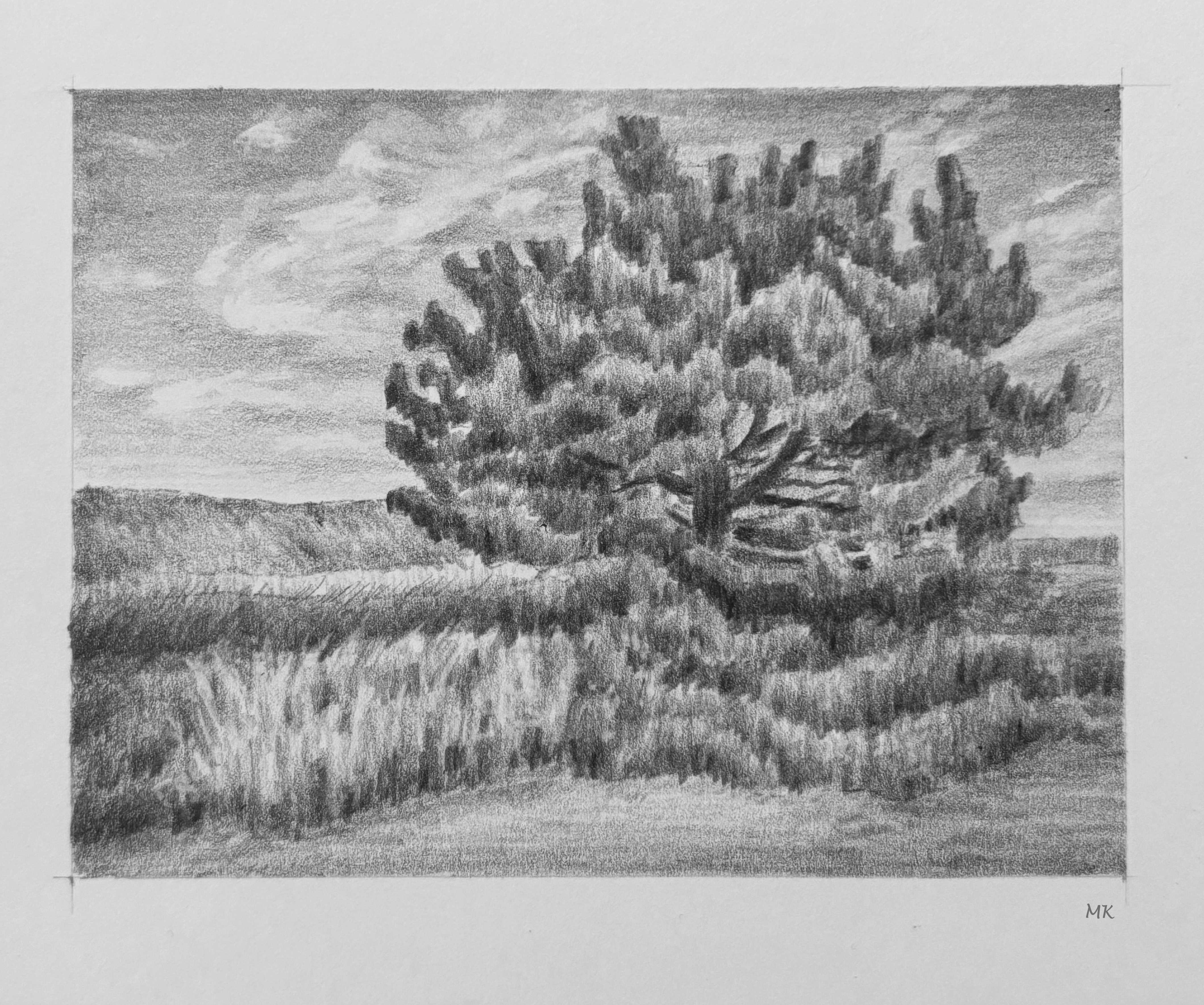
Pine Tree in a Field


This artwork was done as part of a drawing challenge in Ian Roberts' "Mastering Composition" courseFor general information and explanation, please refer to the Foreword section of my Day 1 post here.


I drew this from my own photo. (Graphite pencil on Strathmore Bristol Smooth, 300 series).


*** Because I might use some of the images for future work, I kindly ask that you do not copy or use my drawings as ideas or reference for your own work, or re-post them elsewhere. 

Link to my Instagram page here.


August 22, 2024

30 Day Drawing Challenge - Day 22


A Tree Near a Path


This artwork was done as part of a drawing challenge in Ian Roberts' "Mastering Composition" courseFor general information and explanation, please refer to the Foreword section of my Day 1 post here.


I drew this from my own photo. (Graphite pencil on Strathmore Bristol Smooth, 300 series).


*** Because I might use some of the images for future work, I kindly ask that you do not copy or use my drawings as ideas or reference for your own work, or re-post them elsewhere. 

Link to my Instagram page here.


August 21, 2024

30 Day Drawing Challenge - Day 21


Still Life with a Lemon


This artwork was done as part of a drawing challenge in Ian Roberts' "Mastering Composition" courseFor general information and explanation, please refer to the Foreword section of my Day 1 post here.


I drew this from my own photo, of my own arrangement. (Graphite pencil on Strathmore Bristol Smooth, 300 series).


*** Because I might use some of the images for future work, I kindly ask that you do not copy or use my drawings as ideas or reference for your own work, or re-post them elsewhere. 

Link to my Instagram page here.